Spectrum

AUTHOR
Brad Pitt
DATE
December 19, 2024
TOPIC
Case study
Design lives on a spectrum—of color, emotion, material, and meaning. It’s not fixed to one form or style but constantly shifts depending on context, purpose, and perspective. The richness of design lies in its ability to explore this entire range, to oscillate between opposites and blend seemingly contrasting ideas into something cohesive, functional, and beautiful. In every spectrum, from bold to muted, from sharp to soft, there is a story waiting to be told.
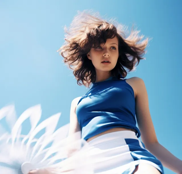
Color is one of the most immediate and powerful tools in a designer’s arsenal. It captures attention, evokes emotion, and influences decision-making before a single word is read. Vibrant hues create energy and urgency, while soft neutrals instill calm and trust. The interplay between colors—contrasts, gradients, harmonies—adds depth and meaning to visual experiences. Whether designing a landing page, a logo, or a product interface, working across the color spectrum allows for more nuanced and dynamic storytelling.
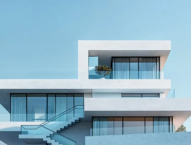
But spectrum in design isn’t limited to color. It’s also about texture, materiality, and form. Matte versus gloss. Rigid versus fluid. Physical versus digital.
Every design decision carries a tactile quality, whether or not it’s physically touched. For instance, a glossy button on a digital UI can feel sleek and energetic, while a soft blur might create a more welcoming or introspective tone. These details, though small, shape how users emotionally interpret and physically interact with what we create.
Typography also lives on a spectrum. A bold sans serif can assert authority, while an elegant serif whispers sophistication. Display fonts demand attention; monospace fonts convey precision. Knowing how to navigate this range—when to shout, when to whisper, when to step aside—is part of the craft. Type choices, spacing, rhythm, and scale are never random; they are deliberate expressions of brand, function, and emotion.
Spectrum thinking also applies to design philosophy. Some projects call for maximalism—layered textures, expressive grids, experimental layouts. Others demand minimalism—restraint, whitespace, subtle motion. Both are valid. What matters is alignment with purpose. Designers who can fluidly move across these extremes and find balance in between are the ones who create work that resonates across audiences and platforms.
In photography and art direction, spectrum becomes especially tangible. Lighting setups that explore contrast—harsh light versus soft shadow—can dramatically change the mood of a campaign. Visual compositions that experiment with color grading, camera depth, and motion blur allow creative teams to guide perception in powerful, cinematic ways. Even still imagery can vibrate with motion when spectrum is used intentionally.
The same applies to brand identity systems. A good identity must operate across a wide range of contexts—from a tiny favicon to a billboard, from a social avatar to an immersive website. Flexibility is key. It’s no longer enough to have a static mark; brands need adaptive systems that function in motion, in dark and light modes, in stillness and sound. The spectrum of applications is vast—and a successful design must be ready for all of them.
Accessibility also lives on this spectrum. Color contrast, motion sensitivity, legible type, and scalable layout all reflect the need for inclusive design. By recognizing the spectrum of human ability and preference, designers create spaces where more people feel seen, included, and empowered. It’s not just good practice—it’s essential.
Ultimately, working across the spectrum is about embracing range without losing coherence. It’s about designing systems that are adaptable, yet grounded in a strong, central vision. It’s about honoring both the analytical and the intuitive, the structured and the expressive.
Design is not a point on a graph—it’s a spectrum of possibility. And by learning to work fluidly within it, we open ourselves to richer ideas, broader audiences, and deeper impact.